
Movie color palettes have the power to evoke emotions, set the tone, and enhance the storytelling in films. From vibrant and saturated hues to muted and desaturated tones, the choice of colors in movies plays a crucial role in capturing the feelings the director wants to convey to the audience. By carefully selecting and manipulating the color palette, filmmakers can create a visual language that adds depth and meaning to every scene.
In this blog, we will explore how movie color palettes are used to evoke emotions, analyze famous examples from iconic films, and discover how you can incorporate these techniques into your own movie canvas art or paintings.
Understanding the power of movie color palettes
Movie color palettes play a significant role in the overall storytelling of a film. From the bright and vibrant colors of a comedy to the dark and moody hues of a thriller, the color choices made by filmmakers can evoke specific emotions and enhance the viewer's experience. Understanding how color palettes work in movies can help in creating visually stunning and impactful films.
Color schemes in movies are carefully selected by directors and cinematographers to convey specific moods or themes. For example, warm and earthy tones are often used in nostalgic or comforting scenes, while cool and desaturated colors can create a sense of distance or detachment. In addition to setting the tone, color palettes can also be used to differentiate between different time periods, locations, or characters within a movie.
Exploring the emotional impact of color in movies
Color plays a significant role in the visual storytelling of movies. It has the power to evoke emotions, set the mood, and even convey meaning. Directors and cinematographers carefully select their color palettes to enhance the audiences' viewing experience and create a more immersive journey.

Movie palette is a collection of colors used throughout a film that, when combined, create a unified visual style. These palettes can range from warm and vibrant hues to cool and desaturated tones, depending on the desired emotional impact. For example, warm colors like reds and yellows are often associated with passion, energy, and intensity, while cool colors like blues and greens can evoke feelings of calmness, sadness, or mystery.
The color palette of a movie can also be used to represent themes or symbols within the story. For instance, a film set in a dystopian future may heavily feature desaturated colors like grays and browns to convey a sense of oppression or decay. On the other hand, a romantic comedy might utilize bright and vibrant colors to evoke feelings of joy and lightheartedness.
The art of translating movie color palettes onto canvas
The art of translating movie color palettes onto canvas requires a deep understanding of color theory and a keen eye for detail. When translating the colors found in movies onto canvas, it is important to capture the essence and mood of the film while also creating a visually captivating piece of art.

To begin, thoroughly analyze the chosen movie's color palette. Pay attention to the dominant colors used throughout the film, as well as any recurring color motifs. Consider the emotional tone of the movie and how the colors contribute to that overall feeling. For example, a film with a dark and moody atmosphere may utilize a lot of deep blues and grays, while a romantic comedy may rely on vibrant pinks and pastels.
Next, select the appropriate paints or pastels that closely match the colors in the movie. It is important to have a versatile range of pigments available to accurately recreate the desired color palette. Mixing colors may also be necessary to achieve the exact shades needed.
When translating the colors onto canvas, it is crucial to pay attention to the composition and proportions of the colors used. Think about how the colors interact with each other and how they can create harmony or contrast within the artwork. Experiment with different color combinations to find the most visually pleasing arrangement.

Additionally, consider the texture and brush strokes used when applying the colors to the canvas. This can further enhance the connection between the movie and the artwork, creating a multi-dimensional experience for the viewer.
Lastly, don't be afraid to add your own artistic interpretation to the colors. While it is important to stay true to the movie's color palette, adding subtle variations or personal touches can make the artwork truly unique and reflective of your own artistic style.
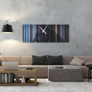
Enhancing your living space with movie color palettes
Color has a significant impact on the overall feel and aesthetic of a space. If you're looking to enhance your living space, why not take inspiration from some of your favorite movies? Movie color palettes can be a great source of inspiration for creating a cohesive and visually appealing look in your home.

When selecting a movie color palette, it's important to consider the mood and atmosphere you want to create in your space. Different movies evoke different emotions, and the color palettes used in those movies can help to create a similar ambiance in your home. For example, if you want to create a calm and serene environment, you might consider a color palette inspired by movies set in peaceful natural landscapes or soothing seaside scenes.
In conclusion, movie color palettes play a crucial role in capturing the emotions and tone of a film. Through careful selection and manipulation of colors, filmmakers can evoke specific feelings and create a visually stunning experience for the audience. If you are interested in exploring the beauty of movie color palettes and incorporating them into your own space, visit our website: https://www.frome.co/ to explore our collection of movie canvas art and movie paintings inspired by iconic films.
Comments
Post a Comment